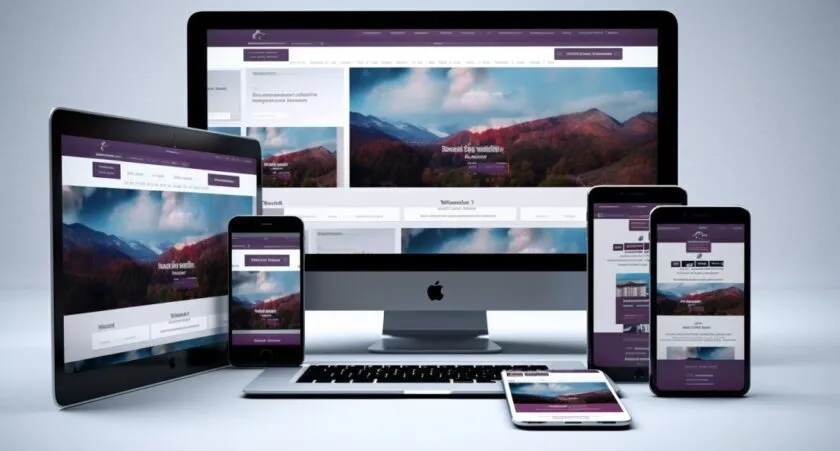
Media Queries Responsive Web Design Tutorials: Mastering the Art of Responsive Design In today’s digital age, responsive web design is not just a trend; it’s a necessity. With over 4.66 billion active internet users worldwide, a significant portion accesses the web via multiple devices. This statistic underscores the importance of responsive design in reaching a wider audience. Our comprehensive guide on Media Queries Responsive Web Design Tutorials equips you with the essential skills to create websites that look great on any screen size. From understanding the basics of media queries to implementing advanced techniques, this tutorial is your gateway to mastering responsive web design. Whether you’re a beginner or an experienced developer, these tutorials cater to all skill levels.
Introduction to Media Queries
Media queries are a cornerstone of modern web design, acting as the architects behind the scenes in responsive websites. Imagine a chameleon; just as it adapts its color to the environment, media queries allow a website to adapt its layout to different screen sizes. This adaptability is vital in an era where users access the web through a myriad of devices – smartphones, tablets, laptops, and more.
Understanding media queries is crucial for any web developer aiming to create versatile and user-friendly sites. These powerful snippets of CSS code enable your website to detect the visitor’s screen size and orientation, altering the layout accordingly. To dive deeper into media queries, check out this comprehensive guide at W3Schools.
Responsive design is not just a trend; it’s an essential component of modern web development. Statistics show that mobile internet usage has skyrocketed, accounting for approximately half of the global web traffic. Ignoring responsive design is like turning a blind eye to half of your potential audience.
The Role of Media Queries in Responsive Design
The magic of media queries lies in their ability to create a seamless user experience across all devices. Imagine a single website that looks just as stunning on a small smartphone screen as it does on a large desktop monitor. That’s the power of responsive design facilitated by media queries.
For instance, a media query can be used to change the layout of a website when the screen width falls below 768 pixels – a common breakpoint for tablets. This change ensures that the website remains accessible, readable, and navigable, regardless of the device used to access it.
Effective usage of media queries can be seen in various case studies where businesses have revamped their websites. For example, a major online retailer saw a significant increase in mobile sales after implementing responsive design with media queries. This success story and others are brilliantly illustrated in this YouTube tutorial, which showcases the practical application of media queries in real-world scenarios.
Mastering Media Queries Responsive Web Design Tutorials is not just about learning a skill; it’s about embracing the future of web development. With the right implementation of media queries, your website can provide an excellent user experience, regardless of how or where it’s being accessed.
Step-by-Step Guide to Using Media Queries
In the realm of responsive web design, media queries are your secret weapon. They’re like a Swiss Army knife for web developers, offering the tools needed to ensure your site looks fabulous on any device. But how do you wield this tool effectively? Let’s break it down.
First, you need to understand the basics. Media queries are a feature of CSS that enables you to apply styles based on the type of device, its size, and other characteristics. For example, you might want a different layout on a phone than on a desktop. This is where media queries come into play. A good starting point for beginners is the detailed guide on Mozilla Developer Network (MDN), which offers an in-depth look at implementing these queries.
Now, for the best practices: Start by defining breakpoints – these are the screen widths at which your site’s layout will change. Common breakpoints include widths for mobile phones, tablets, and desktops. Remember, it’s not just about width; consider other factors like device orientation (portrait vs. landscape) too.
Media Queries Responsive Web Design Tutorials
Moving beyond the basics, let’s explore some advanced techniques and strategies in Media Queries Responsive Web Design Tutorials. These are the tricks that can take your website from good to great.
Consider, for instance, the use of min-width and max-width in your media queries. This approach allows for more fluid and flexible designs, adapting your site not just to current devices but to future ones as well. It’s about creating a design that’s timeless and adaptable, much like a classic piece of literature that remains relevant through the ages.
Looking for real-world examples? Check out this YouTube tutorial, which dives into complex responsive designs. You’ll see how different sites tackle the challenge of a responsive design, adapting their layouts in creative and effective ways.
From intricate grid layouts to innovative uses of images and typography, these examples show just how versatile and powerful media queries can be. They’re not just for simple layout shifts; they can completely transform your site’s aesthetic and user experience based on the device used.
In essence, mastering media queries in responsive web design is about embracing flexibility and foresight. It’s about crafting an online presence that’s as dynamic and adaptable as the web itself. With these tutorials and tips, you’re well on your way to becoming a responsive design maestro, capable of creating websites that respond gracefully to any screen and any situation.
Common Challenges and Solutions
Challenge
Solution
Images not scaling correctly
Use relative units like percentages for image widths.
Text too small to read
Utilize viewport units VW, and VH for text sizes to ensure readability on different devices.
Responsive design, like any great invention, comes with its share of challenges. But fear not! With every hurdle in Media Queries Responsive Web Design Tutorials, there’s a solution waiting to be discovered.
One of the biggest challenges is ensuring your website looks great on all devices. It’s like trying to fit a square peg in a round hole – but with media queries, the peg changes shape! Sometimes, images don’t scale correctly, or text becomes too small to read. The solution? Use relative units like percentages for widths and viewport units for text sizes. This ensures everything scales down smoothly.
Another common issue is the overuse of media queries. It’s easy to get carried away and end up with a stylesheet that’s as crowded as a rush-hour subway. The key is to use media queries sparingly and efficiently, focusing on major breakpoints rather than trying to accommodate every possible device.
Future of Responsive Web Design
Trend
Description
AI-driven design tools
AI algorithms suggest optimal media query settings based on data
Sophisticated media queries
Consider factors like ambient light conditions and user preferences
Pseudo-elements and advanced media queries
Push the boundaries of responsive design for more creative layouts
Looking into the crystal ball of web development, the future of responsive design is as bright as a well-lit LED screen. With the constant evolution of devices, from foldable screens to large 4K monitors, Media Queries Responsive Web Design Tutorials will continue to be an essential skill for web designers.
Predictions suggest that we’ll see more AI-driven design tools, making the process of creating responsive designs faster and more intuitive. Imagine AI suggesting the optimal media query settings for your site, based on user data and device trends!
Also, expect media queries to become more sophisticated. We might move beyond screen size and orientation to consider factors like ambient light conditions or user preferences. This evolution will make websites not just responsive, but truly adaptive to the user’s environment and needs.
For more insights into the evolving world of responsive design, dive into this thought-provoking article at Toptal. It sheds light on how pseudo-elements and advanced media queries can push the boundaries of what we currently perceive as responsive design.
Mastering media queries today means you’re setting yourself up for success in the ever-changing landscape of web design. The journey might be dotted with challenges, but the rewards of creating universally accessible and beautiful websites are immense. The future is responsive, and with the right skills and knowledge, it’s yours to shape.
Frequently Asked Questions
What are Media Queries in Responsive Web Design?
Media queries are fundamental in responsive web design, allowing content to adapt to different screen sizes and orientations. They enable a website to look and function seamlessly across various devices, enhancing user experience significantly.
How do Media Queries Enhance Website Usability?
By using media queries, websites become more user-friendly. They ensure that content is easily readable and accessible on any device, improving the overall user experience.
Can Beginners Learn Responsive Web Design Through These Tutorials?
Absolutely! Our Media Queries Responsive Web Design Tutorials are designed to be beginner-friendly, providing step-by-step guidance to ease you into the world of responsive design.
What Skills Will I Gain From These Tutorials?
You’ll learn how to implement media queries, understand different viewport sizes, and create flexible layouts. These skills are crucial for building modern, responsive websites.
Are These Tutorials Suitable for Advanced Developers?
Yes, advanced developers will find value in our tutorials as well. We cover advanced techniques and best practices in responsive web design, offering new insights and methods to seasoned professionals.
Conclusion
As we wrap up our journey through Media Queries Responsive Web Design Tutorials, remember that the art of responsive design is a continuous learning process. The skills you’ve gained here are just the beginning. Keep experimenting, keep learning, and don’t hesitate to apply these techniques in your projects. Take the next step in your web design journey. Embrace responsive design and create web experiences that stand out in our increasingly mobile world.


